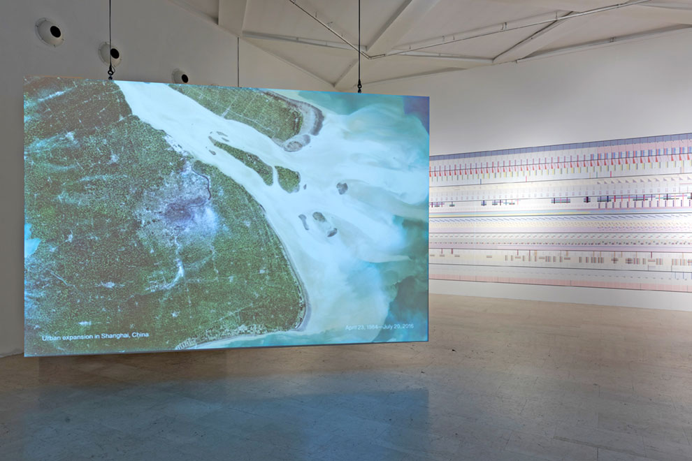
EDITOR’S NOTE: The Room of Change, by design and development studio Accurat (Giorgia Lupi, Gabriele Rossi, Nicola Guidoboni, Giovanni Magni, Lorenzo Marchionni, Andrea Titton and Alessandro Zotta), is a 30-meters-long hand-crafted data-tapestry illustrating how multiple aspects of our environment have changed in the past centuries, how they are still changing, and how they will likely continue changing. Displayed in the first area of the exhibition, next to two big screens projecting images of our Earth changing from above from the NASA Archive, Accurat’s piece encourages us to reflect on how change is pervasive at all scale.
At Accurat, we were commissioned to design an original piece The Room of Change, the first area of the exhibition. For The Room of Change we created a 30-meters-long hand-crafted data-tapestry illustrating how multiple aspects of our environment have changed in the past centuries, how they are still changing, and how they will likely continue changing, addressing many of the topics presented in the exhibition. Combining several different data sources depicting the world from both global and local-individual perspectives, the installation tells stories of people and their relationship with what has been around them over time, layering dense and granular information within the narration to highlight how change is pervasive at all scales.
Besides our contribution, the room hosts two big screens projecting images of our Earth changing from above from the NASA Archive and covering the past 20 years. With our piece, we wanted to complement the “bigger scale” of the projections with a type of story about change that could be relatable, smaller and connected to our everyday lives and our mundane experience.
With this premise, our guiding principle was the idea that most of the change we experience is only shown to us from far away and high above. At first glance, a visitor might not even realize that data is the organizing principle of the motif. However, the data-driven wallpaper creates a morphing visual pattern that unveils the importance of a perpetual interplay of scales and dimensions when assessing change, and illustrates the evolution of many recurring themes of the show: a subtle and poetic tapestry depicting change, from our past to our present to our future.
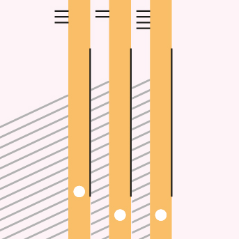
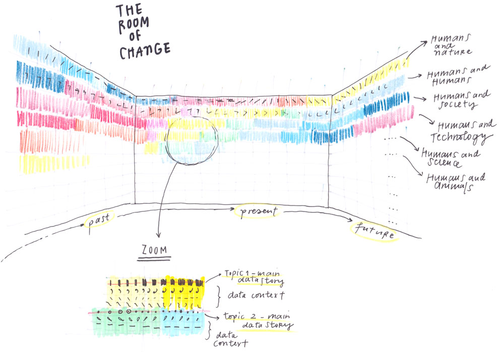
From left to right, time flows on the wall through the visual patterns, covering our past, our present, and our future; and where each of the visual components defining the pattern is a theme, and each vertical section of the wall becomes a snapshot of a precise moment frozen in time.
The piece revolves around eight macro topics that organize information, all related to humans, but that reveal consequences that oftentimes affect us and other species simultaneously. Each horizontal stripe depicts the evolution over time of one single story of change, told thru a combination of datasets on the topic evolving over time.
They are illustrated through a number of global data sets (world population, average temperatures, disease rates, energy consumption, et cetera) to frame large-scale phenomena with broad strokes as well as single and specific stories that will directly or indirectly represent the micro consequences of the large-scale phenomena (such as the disappearing Aral Sea, the dip in life expectancy in Cambodia during its civil war, the quick shift in South Korean exports from agricultural products and commodities to high tech, and more).
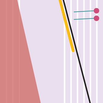
A legend accompanies the piece to explain the global framework and how to read the individual stories. The legend is placed at the center of the room, inviting visitors to discover our changing world from a privileged perspective: a pedestal to navigate the big changes in the same way you would look at mountain range with the help of a navigating map.
The research and design have been conducted with a deliberately humanistic approach: data represents real life, it is a snapshot of the world just as a picture captures a small moment in time. Numbers are always placeholders for something else, a way to capture a point of view—but sometimes this can get lost.
In fact, even if we are depicting “data”, this data needs always to speak to us – human beings – it is always based on subjective collection and interpretation and will always have different meanings for different people. As designers, the more we’re able to combine – “colder” and more sterile type of data, with layers of contextual, smaller and more relatable type of information, the more meaningful results we can achieve.
We would like to thank Repower for generously backing The Room of Change.


